2 Good UI design
Airbnb Pros:
Airbnb Pros:
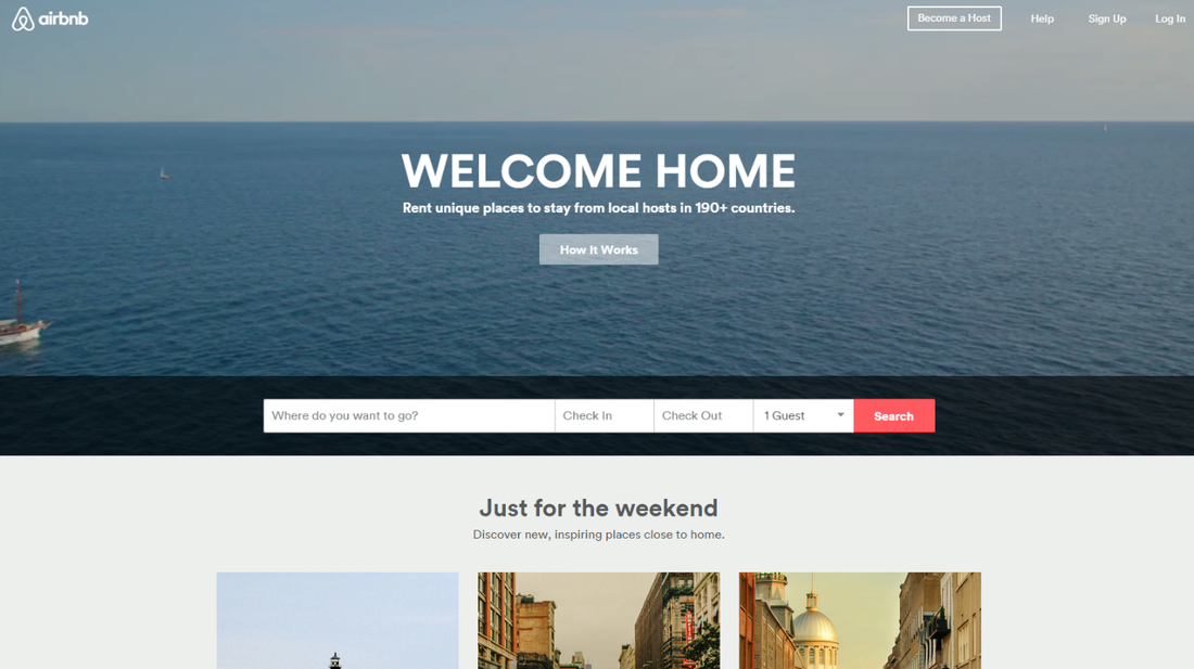
Airbnb has a very clean interface. The homepage is designed without columns. And in the top of webpage, there are photos flashing, which show a moment that the people are smiling and enjoy the life in a very comfortable environment. If you watch several photos, you will observe the pattern of the UI team to choose picture. We will be affected by these warm pictures, and then connect the comfortable travel with this B&B brand.
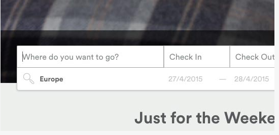
It is common that the websites records the user’s searching history in during a period. But Airbnb is different to others that it can also show the searching records which are used in other websites before.
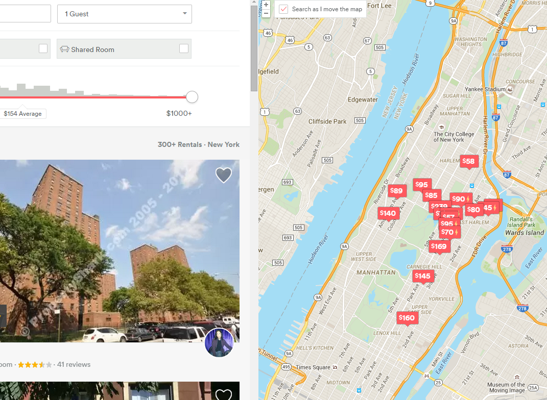
When the user clicks on the any place on the map, the results in the left column will update. It is a kind of matured UI design.
Cons
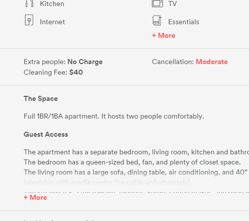
When the user click on the “More” button, the more details will drop down, however, there is no retract button to reduce the contents. This will increase the time cost of user browsing the whole webpage.
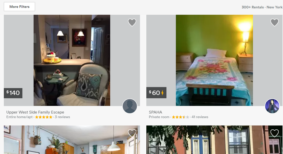
In the searching result column, each line only contains two room, and there is no button for user to view the number of rooms in a line or a whole page.
Lumosity
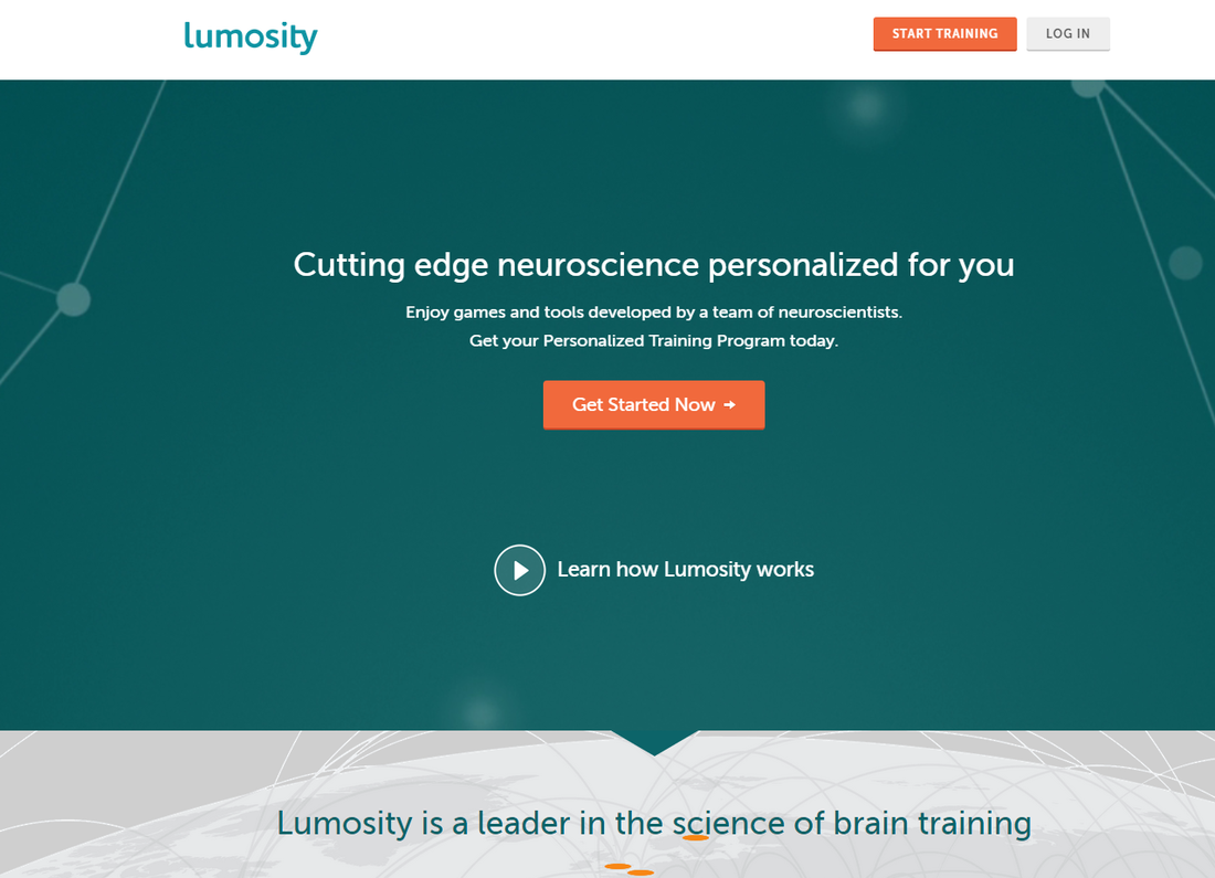
Lumosity is a website for training the users’ intelligence by playing games. For the new user, the website will give 35 free games, which are all designed scientific. And you will need to do a survey first to decide which intelligence aspect you want to develop, and then the web will come up with your personalized training program.
In this homepage, there is a button for the user to start a survey and get a personalized training program. It shows that the company is not focusing on increasing the number of users and profit, etc.
In this homepage, there is a button for the user to start a survey and get a personalized training program. It shows that the company is not focusing on increasing the number of users and profit, etc.
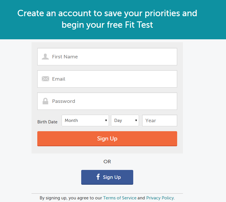
After done the survey, we have to create an account. This interface is very clean, and only require 3 simple information from the users, which really decrease the cost of user creating account.
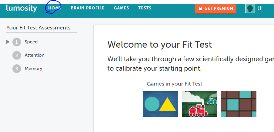
The annoying problem on this page is that if you click on the home button, there will be a flash as follow picture in the center of page. And you cannot close it. Moreover, you repeat the action, the flash still appears.

2 Bad UI designs
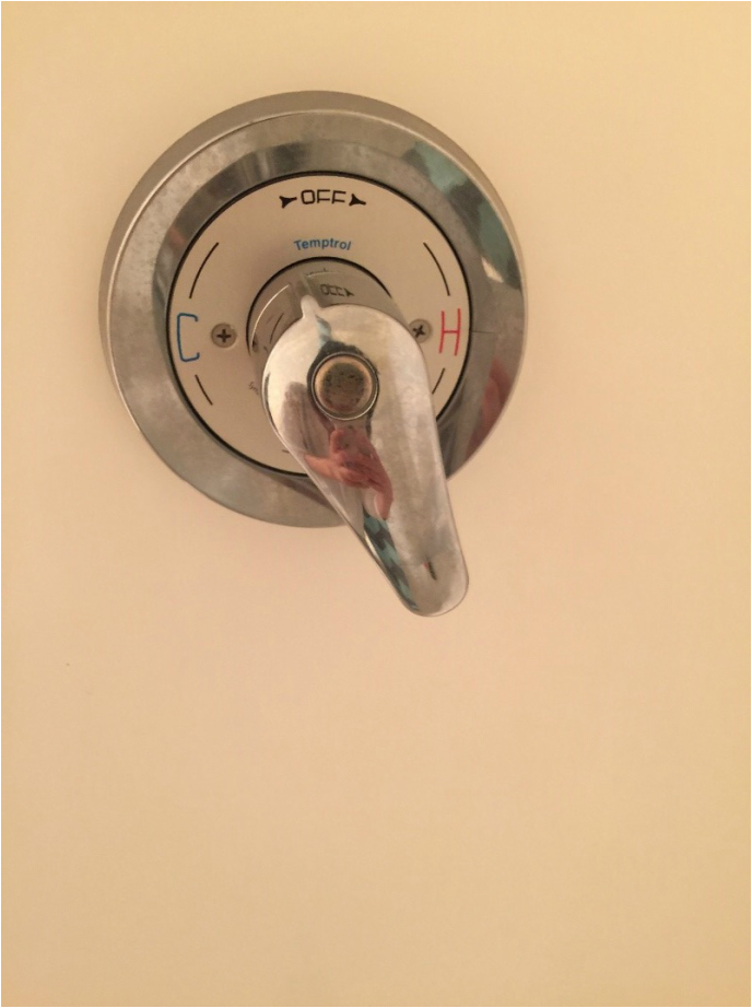
The shower controller is really a bad design. This controller only can adjust the water temperature, but it cannot adjust the water volume, and it cannot be taken off by rotating the handler from the hot side to the center line. When I wash my hair, I would like to take off the controller in order to save the natural resource. However, the next occasion makes me really angry is that I rotate the handler and ready to wash out the shampoo, the water comes out is too cold! I think the handler should be fixed through the following recommendation: the handler should be able to rotate from the different direction. A circle movement could be adjusting the water temperature. And front and back movement is to adjust the water volume.
The process to verify my google account
I do not have a screen shoot because the problem I met was 1 month ago when I was in china. And now it is solved once I came to USA.
When I was in china, I tried to log into my Gmail application. But the application remaindered me that my account activity was unusual, and the equipment for signing in was not the one I used to use. So my account was frozen. If I want to reuse this account, I have to pass the security checkup process. The process is simple, I only have to successfully match the phone number I set at the beginning. But the number have not been used for 2 years, I cannot recall it. So I chose another option to go through the security process. However, this time, this process was really complexity, it asked me so many questions, such as what is the first time I used google doc, and when is the latest time I logged into google account, etc. And I was most excessively mad because there was no reply even I submit my answers to those ridiculous questions. At that time, I also thought about chatting with the employees who can help me deal with that. But there is no link to chat online or other contact information. This is a really bad user experience.