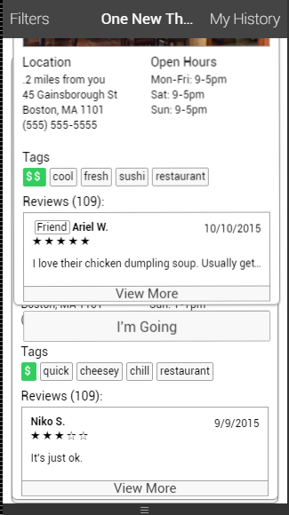
1. The filter bar is very good, and the filter conditions all basically satisfy the user's needs. As there are not many filter constraints, it will be easy for the users to use.
Heuristic: Recognition rather than recall
Severity: Good
2. In the filter bar, the images with headers are not very clearly indicating the number of goers. Does the second one means a small group or two people? As well as the third one makes me confuse.
Heuristic: Help user recognize
Severity: Minor
3. When I click on "I'm going", it is ok that the button will be filled in green, and the text will be "going". But when I change my mind, and decide not to go, I click on the button, the button does not change state which is still marked. According to my past experience, If I want to go back to the original button state in mobile app, I just need to click on this button again. For example, if I bookmark a restaurant on yelp by mistake, I only have to click on the "bookmark" again, and then the "bookmark" will be canceled.
Heuristic: User Control and freedom
Severity: Minor
4. In the beginning, I just saw you only have one restaurant in the homepage, and I did not realize that the way about dragging the page out of the screen to look through other restaurants. But it is still a good design!
Heuristic: Help and documentation
Severity: Cosmetic

5. When I look through all recommendations, the last card also can be dragged out of the screen. And there is no way for me to go back look these recommendations again. There is only one empty panel. In my opinion, you should keep the last card on the panel, and give a remind to the users and tell them that it is the last one, as well as you should permit the users to drag the gone recommendation cards back.
Heuristic: User control and freedom
Severity: Major
6. It does not make sense that I can write down 7 for start rating, which exceed the standard 5 stars. There should be a confirm dialog reminding the user cannot write the number bigger than 5.
Heuristic: Error prevention
Severity: Minor
Heuristic: User control and freedom
Severity: Major
6. It does not make sense that I can write down 7 for start rating, which exceed the standard 5 stars. There should be a confirm dialog reminding the user cannot write the number bigger than 5.
Heuristic: Error prevention
Severity: Minor

7. There is a text "no more suggestions :(" floating in the center of page. It happens when I drag all card out of the screen, and then click "apply" button in Filters bar.
Heuristic: Aesthetic
Severity: Minor
Heuristic: Aesthetic
Severity: Minor

8. I viewed this app in iphone5 device, but the "I'm going!" button was cut off in the screen. You should deal with the resize problem.
Heuristic: Aesthetic
Severity: Minor
Heuristic: Aesthetic
Severity: Minor
9.The recommendation card can be dragged by the user to any direction, look like the screenshot, it also can be dragged to the top, bottom, left and right. You should constraint the dragging direction.
Heuristic: Aesthetic
Severity: Minor
Heuristic: Aesthetic
Severity: Minor
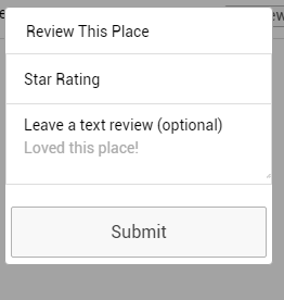
10. According to my understanding, if you do not mention the star rating is optional, so the field is requested for the user to write down a number. However, when i write down some words review, the review still can submit successfully.
Heuristic: Error prevention
Severity: Minor
11. In the star rating field, I input some letters, and then click "submit". Although it does not submit successfully, there is no confirm dialog reminding that the user input wrong information in the text field. If there is no remind, the users may not understand the problems.
Heuristic: Error prevention
Severity: Minor
Heuristic: Error prevention
Severity: Minor
11. In the star rating field, I input some letters, and then click "submit". Although it does not submit successfully, there is no confirm dialog reminding that the user input wrong information in the text field. If there is no remind, the users may not understand the problems.
Heuristic: Error prevention
Severity: Minor
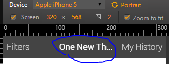
12. The title "One New thing" is abbreviated because there is not enough space for those words. You should modify the size of words or the font issues.
Heuristic: Aesthetic
Severity: Cosmetic
Heuristic: Aesthetic
Severity: Cosmetic